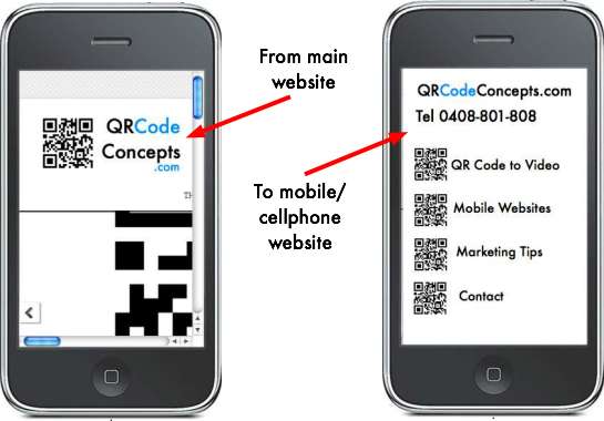
If you’re in business you probably have a website, but do you have a mobile phone-sized website?
What I mean is, do you have a website suitable for mobiles (cellphones) and other hand-held devices?
Technology is zooming ahead so fast we need to keep up by offering our potential customers more than one way of viewing our information.
With a mobile-sized website, you don’t need a 10, 20 or even 40 page website – you only need around 5 pages to get your point across:
- The viewer only has a limited amount of space to view the site on their mobile phone, so it needs to be the right size.
- The viewer doesn’t need to scroll around a big website on a hand-held device, it all takes time and costs money, so make it quick, easy and very inexpensive for the viewer.
- If a viewer visits your main website, wouldn’t it be great if it automatically detected that they were viewing from a mobile phone, and automatically redirected them to the mobile-sized website – without them even realising?
- Most viewers want answers – right now – so they only want to see WHERE, WHAT AND HOW – were can they get it, what do they need to do to get it, and how much will it cost?
- Your mobile-sized website becomes another clever way to market your business to a huge audience, without having to reinvent the wheel and create a huge new website.
- Get your message in front of more faces by utilising a mobile phone-sized website for your business today.
- View example mobile websites.
If you need help to do this, email me or give me a call and let’s talk over what you need to do to reach a new group of potential customers.
[button link=”mobile-website-design.html”] Read more >>[/button] [button link=”contact.html”]Contact Teena today >>[/button]

